Designing faster discovery of cashless-claim hospitals during emergencies
Team
UX Designer (Myself)
1 Product Manager
1 Frontend Developer
1 Backend Developer
Role
Conceptualisation
Design
Prototyping
Dev hand-off
Client
Insurance & Lifestyle app
Designed for
Cashless claims experience
Timeline
3 weeks, 2024
* Client specific details are concealed or substituted with placeholders due to NDA *
Overview
This project involved designing and improving experiences for a leading pan-Asian life and health insurance app serving 10+ million users across 8 markets.
The app offered policy management, claims, payments, rewards, and lifestyle features like wellness and gaming, all in one platform. This feature design was focused on strengthening the cashless claims flow to better support users in emergency situations.
What is cashless claims?

Cashless claims allow treatment at network hospitals without upfront payment, reducing financial and emotional stress—especially in emergencies. With 63% of users preferring this option, it’s one of health insurance’s most valued benefits.
In theory, the process sounds really simple
Walk into a hospital 🏥 >
Show an ID 🪪 and 'other' documents 📑 >
Get treated while the insurer settles the bill directly with the hospital 🏦
But, the reality is a maze..
The "15-Step" Emergency
Finding the right hospital is harder than it should be. While the insurer did provide lists of network hospitals, these were rarely designed for real-world emergency use.
The Discovery Gap: Hospital lists were often shared as static PDFs or buried deep within long, hidden website flows.
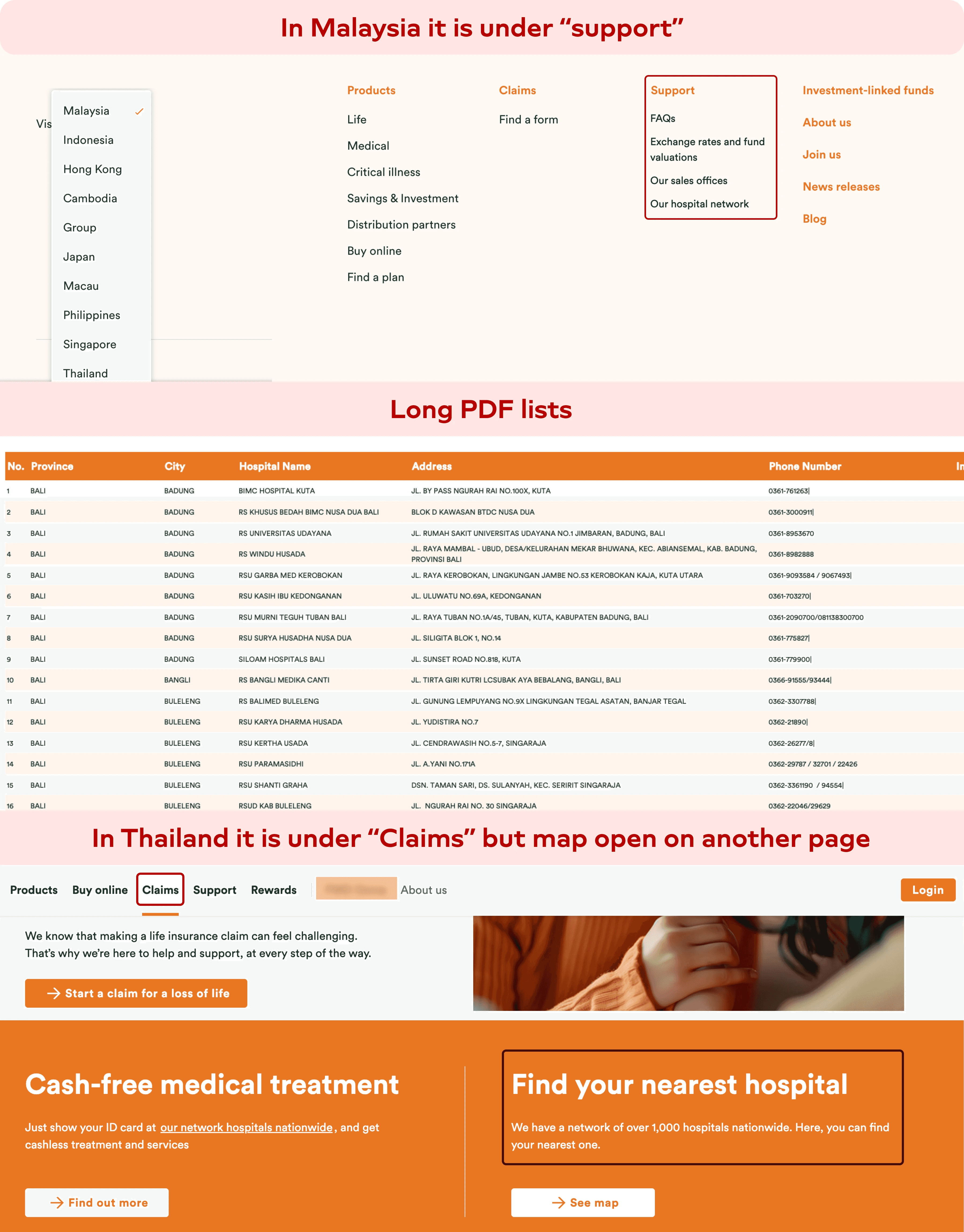
The Data Vacuum: Large, bare-bones lists force users to call hospitals to verify service offerings, exclusions, pre-authorisation rules, etc.

The "Paperwork" Panic: Users arrived at the desk only to find they were missing a specific document or ID, leading to claim denials.

The result is a benefit that exists on paper 📄 but is difficult to use successfully in practice.
An added Challenge? Localisation 🇹🇭!
This wasn't just a fix for one market; it was a blueprint for 8 Pan-Asian countries, but starting with the Thailand market only.
Language-Driven Design: Thai script has unique character spaces and lengths. Hence, design decisions were also driven by an added factor.

For the experience to truly support cashless claims..
We needed to help the user
Find the right hospital quickly in times of crisis
Easily filter down the medical services they are particularly looking for
Visibility into what services are supported at each hospital/ clinic
Clarity on exceptions, exclusions, or special conditions
Guidance on what documents were required to avoid last-minute failure
This reframed the problem from “building a hospital locator” to designing an emergency-ready decision support system.
Solution ✨
To help user find the right hospital quickly in times of crisis
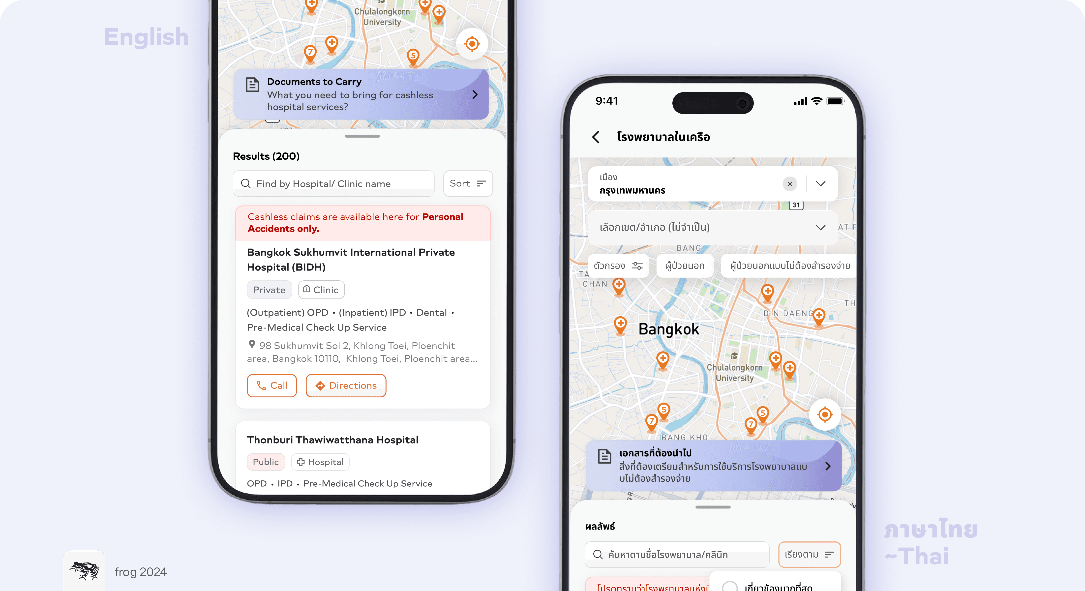
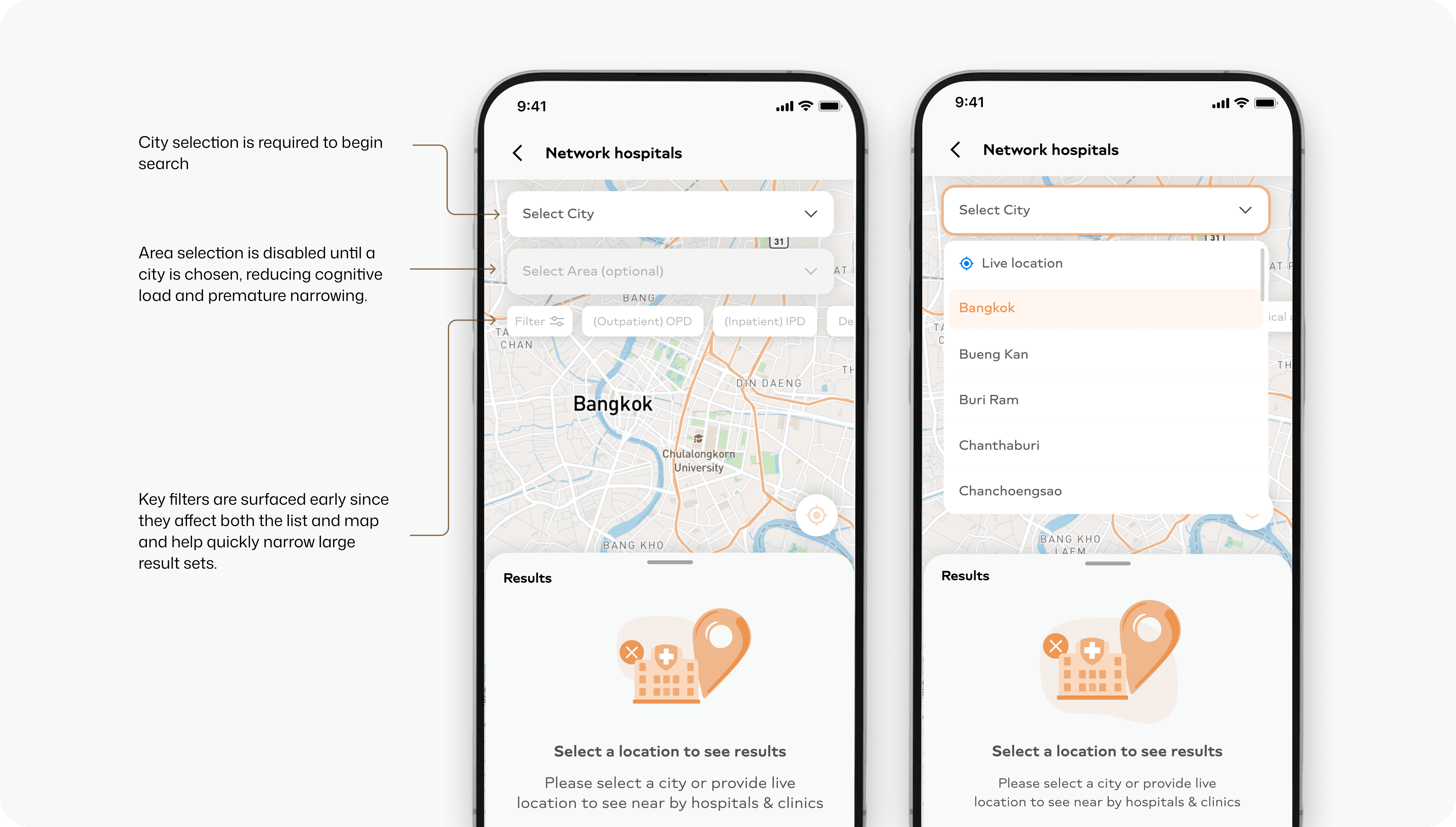
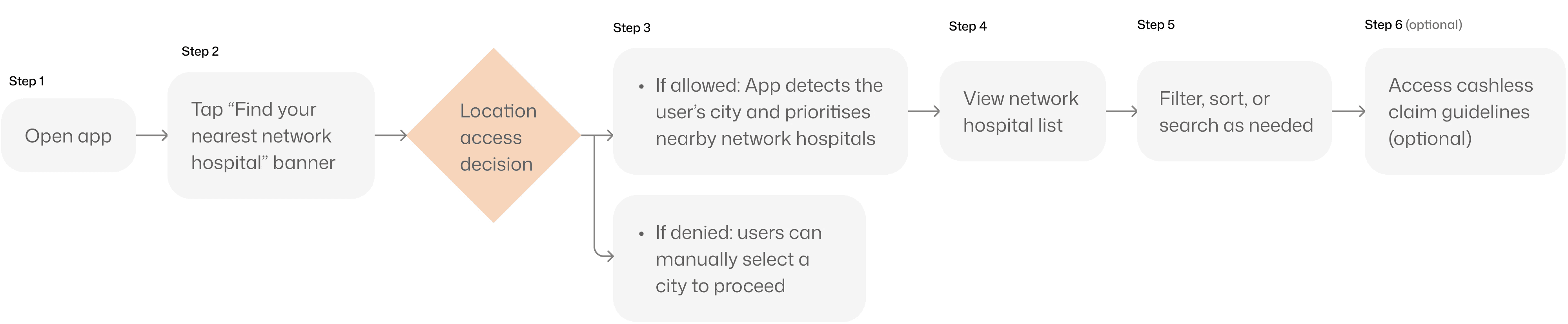
The feature is surfaced directly on the home screen to enable fast access. On entry, the app requests live location to prioritise nearby network hospitals. Manual city and area selection remain available but are intentionally deprioritised, recognising that speed outweighs precision in emergency contexts.
To eliminate ambiguity, results are shown directly on the map, grounding users spatially and reinforcing trust.

Structuring Search for Speed, Scale and Clarity
The backend hospital database was structured around cities and areas as separate entities, which required the frontend experience to mirror this hierarchy. We chose to align the UI with the underlying data structure – but in a way that reduced cognitive load for users.
To do this, selecting a city became the only mandatory step to begin the search. Area selection was intentionally kept optional and disabled until a city was chosen. This ensured users weren’t overwhelmed with unnecessary choices upfront.

Bringing Filters Forward in the Journey
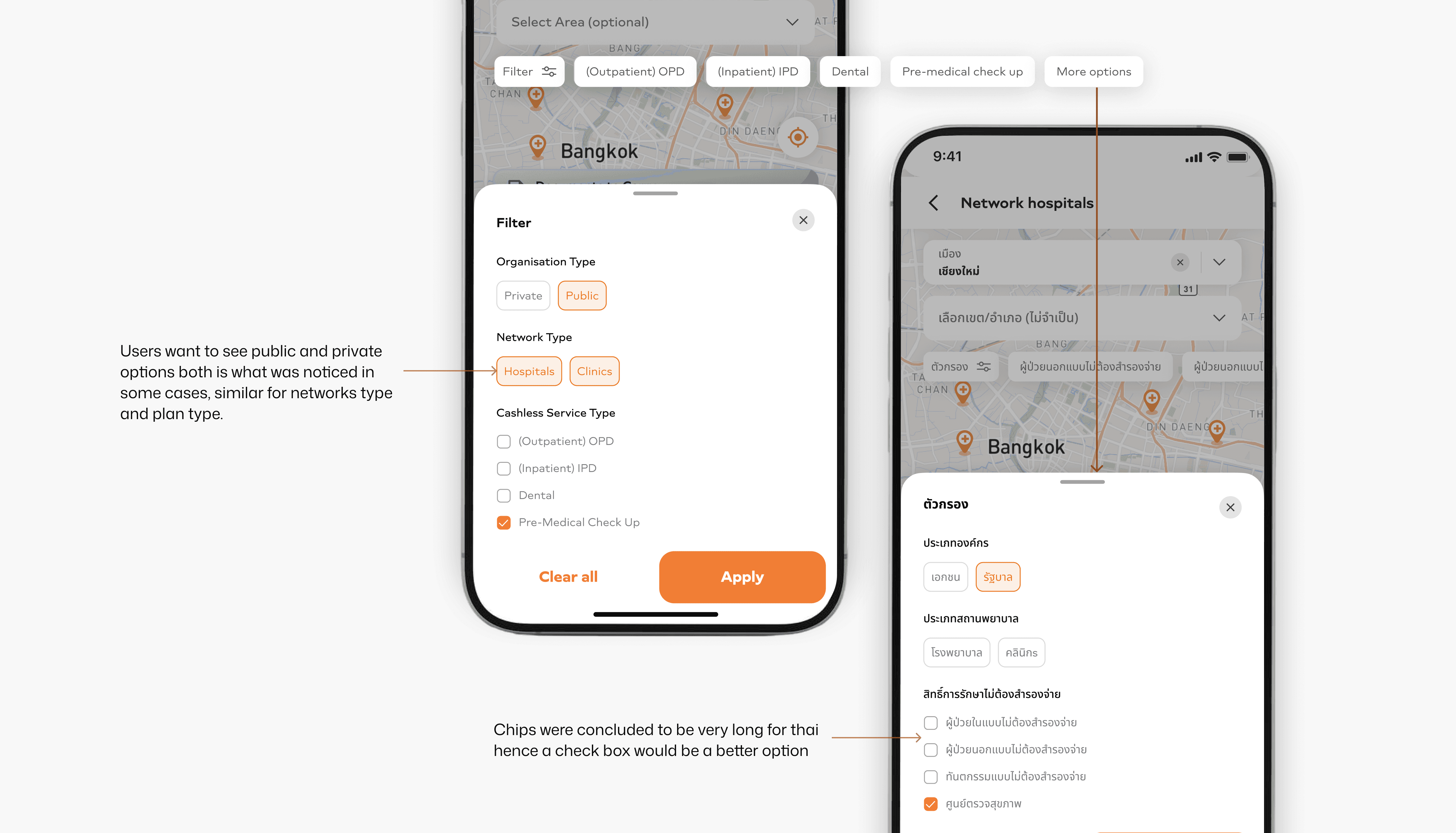
With hundreds of hospitals in the system, filtering had to appear early in the journey, instead of hiding all filter options behind a modal. Key filters are surfaced immediately to help users understand how results can be narrowed, while advanced options remain accessible under "More options" without interrupting the flow.
This helped users immediately understand:
What dimensions the data could be filtered by
List-Level Controls
Search and sort were placed within the results bottom sheet, introduced only after results are visible. With lists often exceeding 300–400 hospitals, search acts as an optional refinement rather than a mandatory first step.

Card design
Initially the card was designed in English, but when later tested in Thai using Localize, the cards looked bulky and overloaded in some cases, and in some they failed to surface critical disclaimers.
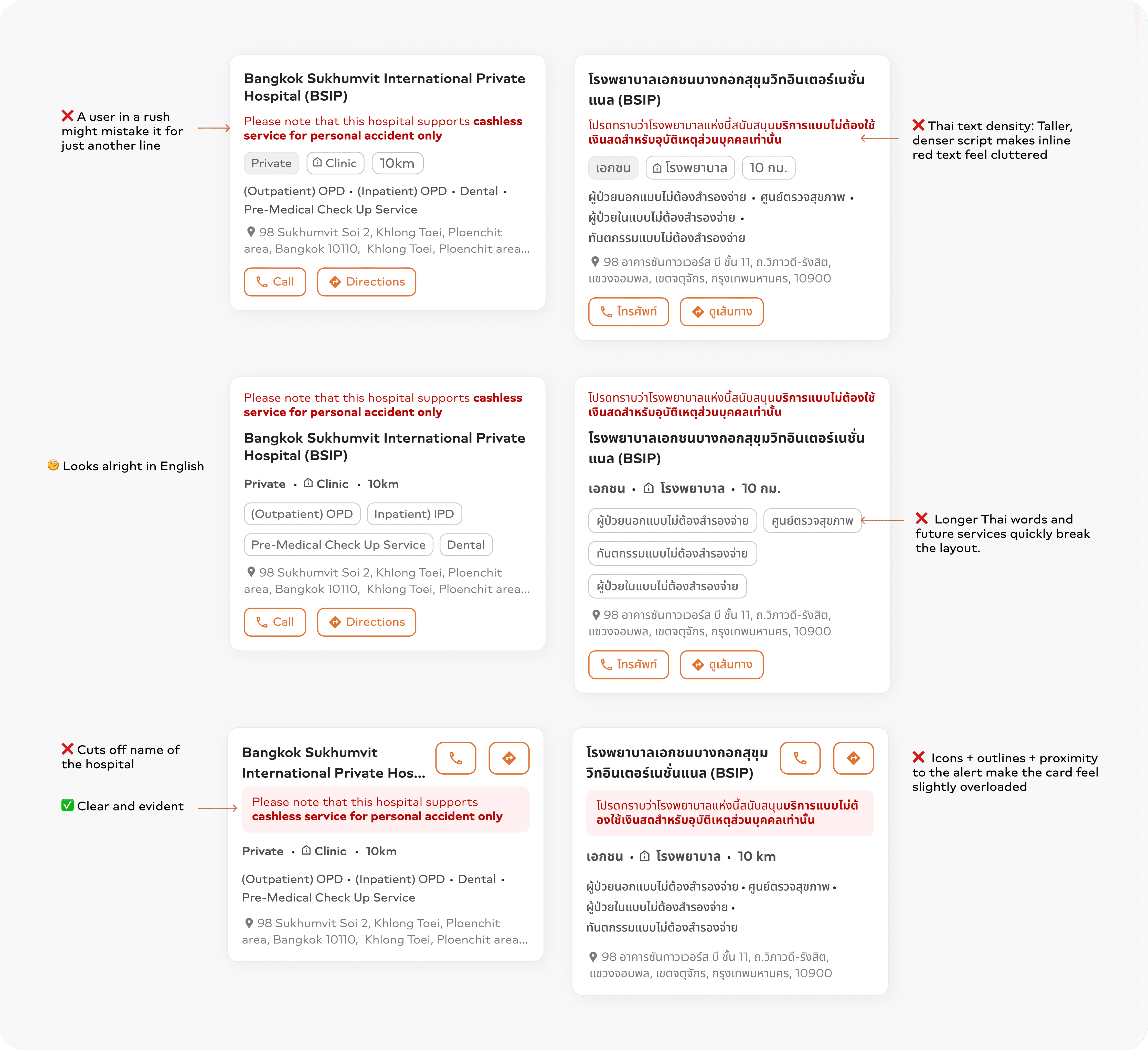
The finalised layout prioritises a structured layout for clear information grouping, readability in dense scripts, clear CTAs, balancing compactness with whitespace & scalable service listings.
Chips are used for binary or fixed attributes (e.g., private/public, clinic/hospital, distance) to avoid overloading chips with complex/variable information.
Services are shown as free-flowing text, as they are text-heavy and likely to grow, preventing bulky, cluttered layouts as more services are added over time.

Filters
Component choices were informed by language constraints—chips for short, binary filters and checkboxes for longer Thai labels to maintain clarity at scale.
Guidance to Prevent Claim Failures
Users often reached hospitals unsure about cashless requirements, leading to last-minute stress and claim rejections due to missing documents. To address this, a persistent “Documents to Carry” banner was introduced within the hospital discovery flow. It surfaces critical, policy-specific information at the moment of intent and links to a concise guide covering required documents, FAQs, and edge cases.

Map–List Sync
When a hospital is selected on the map, the list automatically scrolls to and highlights the corresponding card, creating a connection between map and list views. The way the user scrolls up to see the entire list, the constant banner stays until the user has fully let the list take over the page so as to not let the user miss the banner.

Old user flow 🤯 (web)
Discovery is fragmented across pages, critical information is hidden behind content and users must work hard to qualify hospitals and too many steps

New user flow ✨: Discovering Cashless Network Hospitals (In-App)
Number of steps reduced to 5 by introducing a better version of the web feature on the mobile app
Impact
2x faster
discovery of feature and of cashless hospitals in times of emergency
Reduced
dependency
on manual clarification
Strengthened
consistency
across markets
without fragmenting the experience
Whats next?
We wanted to let users select their insurance plan upfront before checking cashless hospitals. This ensures only eligible hospitals and services are shown, sets clear expectations early, and reduces last-minute claim rejections.
My takeaways from this..
Language shapes design. Layouts and patterns that work in one language don’t always scale to others - early translation testing helps reveal real constraints sooner.
Small features are never small. Filters and sorting require careful UX and component choices to avoid complexity.
Backend limits may surface as user pain, but we can try to reduce it as much as possible. By making only the essential step (city) mandatory and keeping area optional, we reduced cognitive load while still respecting the city–area data structure.